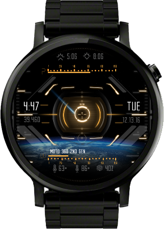
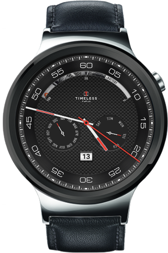
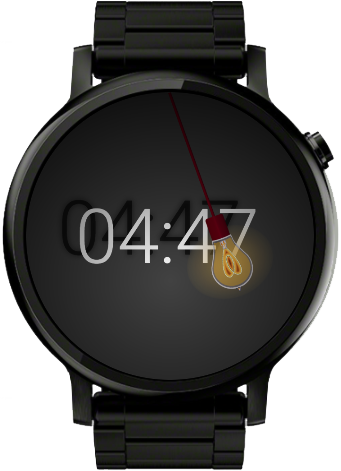
Good watch face design typically has a few characteristics. They are focused, have a clear hierarchy and have great color harmony. Keep all of those in mind when designing.
Watchface Checklist
✓ Do you have a DIM mode? when DIM mode is active it should be either pure black and pure white to display well on all watchfaces.
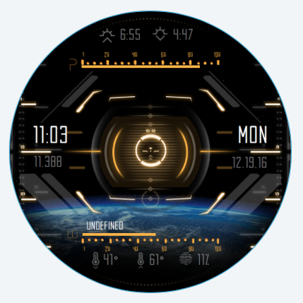
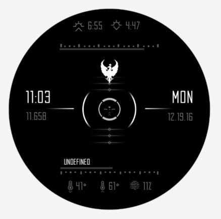
✓ Dim mode includes the time
✓ Fonts are readable
✓ It has good contrast
✓ All features that are included are working as intended (weather, location, time, step count, battery, etc)
✓ Watchface uses recommended tags like #Db# so that the user can later choose their preference.
Design specs
Download the starter template
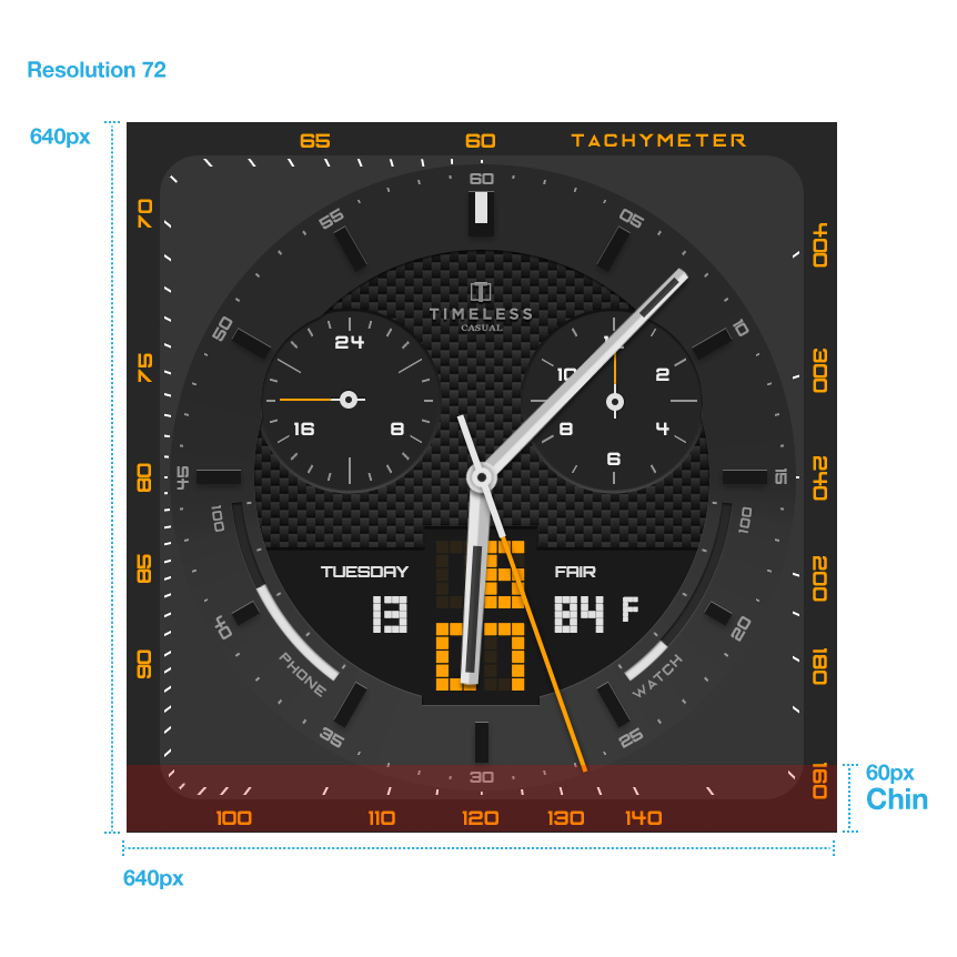
Canvas is 640 x 640px at 72 dpi/ppi. You might also want to consider that some watches have a chin at the bottom which would hide any design elements that would be down there on selected models. The editor also gives an option to preview the chin with the leftmost button, which is located right below canvas preview

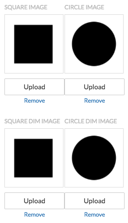
Make sure you design for both square and circle and DIM mode.
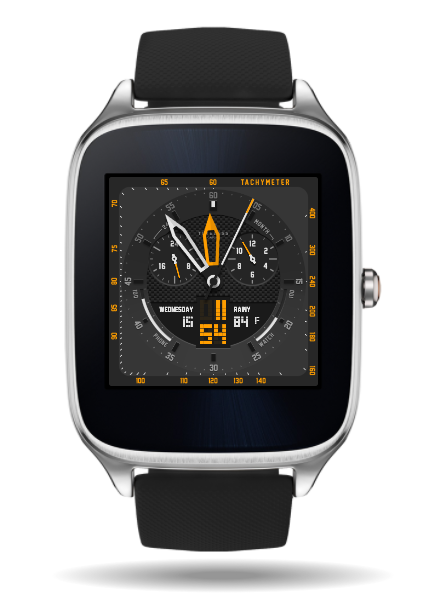
You can do this by clicking advanced button on an image layer  and then uploading different images for square and circle.
